1962
Original uniform design
Team Colors: Royal Blue and Orange
HOME UNIFORM
Jersey:
Design Description: Original design combines aspects of the uniforms of the New York Yankees,
Brooklyn Dodgers and New York Giants. White button-down jersey with royal blue pinstripes
(pinstripes based on the Yankees), with "Mets" in script across front on an upward slant
(layout style based on that of the Dodgers).
"Mets" script is royal blue (taken from the Dodgers) outlined in orange (taken from the Giants).
Royal blue undersweater.
Numbering Style: Block, two-color (royal blue with orange outline), eight-inch numbers.
Block style is same as the style used by the Yankees at the time, although the Yankees
were using one-color numbers; the Mets use two-color.
Pants & Other:
Design Description: White belted pants with royal blue pinstripes.
Royal blue belt. Solid royal blue stirrups with white sanitaries.
Cap:
Same for home and road uniforms.
Cap Description: Solid royal blue cap.
Logo Description: Orange Interlocking "NY", based on the logo of the New York Giants.
ROAD UNIFORM
Jersey:
Design Description: Gray button-down jersey with royal blue piping,
"New York" in fancy print, all capitals, arched across the front (taken from the Giants).
Letters are royal blue with an orange outline. Mets "skyline" logo patch on left sleeve.
Royal blue undersweater.
Numbering Style: Full-block, two-color (royal blue with orange outline), eight-inch numbers.
Full block style is in contrast to the numbering style on the home uniform, which is block.
Pants & Other:
Design Description: Gray belted pants with royal blue piping down the sides. Royal blue belt.
Solid royal blue stirrups with white sanitaries.
1964
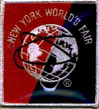
A patch commemorating the 1964-1965 Worlds Fair is added to the left sleeve of the home jersey.
The Worlds Fair patch is also added to the road jersey, but on the right sleeve.
(Honig, Donald, New York Mets: The First Quarter Century, page 36, 39).
1965
Worlds Fair patch remains on left sleeve of home jersey and right sleeve of road
jersey for second and final season. (Topps 1966 Baseball Cards).
Numbers are added to the front of the uniform. Placed at the lower left,
the numbers are two-color (royal blue with orange outline), four-inch; and are block on
the home jersey and full block on the road jersey, consistent with
the respective numbering styles on the back.
1966
Mets "skyline" logo patch, which has always been on the left sleeve of
the road jersey, is added to left sleeve of the home jersey.
Worlds Fair patch is removed from uniform.
1969
A patch commemorating 100th Anniversary of Major League Baseball is worn,
for this season only, by all teams. The Mets wear it on the left sleeve of both home
and road uniforms, temporarily removing the Mets "skyline" logo from the jersey
during the regular season and playoffs. But for the World Series, the 100th Anniversary
patch is moved to the right sleeve of the home uniform and the Mets "skyline" logo patch
returns to the left sleeve. The 100th Anniversary patch remains on the left sleeve of
the road jerseys during the World Series and no patch is worn on the right sleeve of
the road jersey (as during the regular season).
1972
Switch is made from flannel uniforms with tackle-twill and felt lettering to
double-knit uniforms with all tackle-twill lettering. The most visible change
in the double-knit uniform is the change to more pronounced, "zigzag" pinstripes.
A black armband is worn on the left sleeve of both home and road uniforms in
honor of Mets manager
Gil Hodges.
Hodges died of a heart attack on April 2, 1972
and was replaced by coach
Yogi Berra.
1974
"New York" on front of road jersey is replaced with "Mets" in script
across front on an upward slant.
Full-block numbers are changed to a different style full-block number that
more closely resembles, in style, the block numbering on the home jersey.
The new full-block style numbers are still two-color (royal blue with orange outline),
still four inches on the front, 8 inches on the back. They are used on the road jersey
through the end of the 1977 season.
1976
A patch commemorating America's bicentennial is worn, for this season only,
on the right sleeve of both home and road uniforms. (Topps 1977 Baseball Cards).
Alternate "pillbox" style cap commemorating America's bicentennial, used
only this season for selected games. Besides the pillbox style, the only
other difference from the regular cap is three orange stripes that go around the circular cap.
A black armband is worn on the left sleeve of both home and road uniforms
in honor of the Mets' first owner, Joan Payson, and first manager, Casey Stengel,
both of whom died during the off season.
("Past Time," New York Mets 1993 Official Yearbook, p. 71).
1978
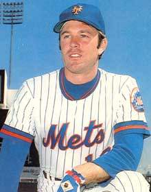 John Stearns wearing new 1978 pullover jersey
|
Home jersey changes from a button-down to a pullover with a two-button, crew-neck collar.
Three equal-width stripes (royal blue-orange-royal blue) are added to collar and sleeve edges.
Mets "skyline" logo patch remains on left sleeve.
Road jersey changes from a button-down with piping to a pullover
with a two-button, crew-neck collar. Three equal-width stripes
(royal blue-orange-royal blue) are added to collar and sleeve edges.
Mets "skyline" logo patch remains on left sleeve.
Block numbers, identical to the style of numbers used on the front and back
of the home jersey replace full-block numbers on the road jersey.
Royal blue piping down the sides of the road pants is replaced with a thin triple
stripe (royal blue-orange-royal blue) down the sides.
1979
Names are added to the back of the road jersey.
(The National League passed a rule in 1979 requiring all teams to wear names on their road uniforms.) Placed in an arch on a nameplate, the pro-block letters are 2-color (royal blue with an orange outline), 3-inch; and are not vertical arch. Players with long names have pro-block letters that are slightly thinner.
Names are also added to the back of the home jersey. Placed in an arch on a plain white
(no pinstripes) nameplate, the letters are two-color (royal blue with an orange outline),
three-inch; and are not vertical arch.
Players with long names had letters that were slightly thinner.
1981
The Mets begin to use "batting practice jerseys," also referred to at
the time as "warmups." ("Batting practice jerseys" will not be extensively
documented, as they are not part of the "game" uniform, and there have been
so many variations over the years that it would take up an undue
amount of space to document each variation and design.
Nevertheless, it is significant to note when teams began using them regularly).
The Mets Logo
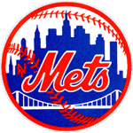
The circular Mets logo, designed by sports cartoonist Ray Gatto and
unveiled on November 16, 1961, has gone virtually unchanged throughout
the history of the club. The shape of the insignia, with its orange
stitching, represents a baseball, and the bridge in the foreground
symbolizes that the Mets, in bringing back the National League
to New York, represent all five boroughs.
It's not just a skyline in
the background, but has special meaning. At the left is a church spire,
symbolic of Brooklyn, the borough of churches. The second building from
the left is the Williamsburg Savings Bank, the tallest building in
Brooklyn. Next is the Woolworth Building. After a general skyline view of
midtown comes the Empire State Building. At the far right is the
United Nations Building.
("The Mets Logo", 2001 New York Mets Information Guide, page 4.)
|
1982
While the home uniform remains the same, changes are made to the road uniform.
Road jersey changes from a pullover with a two-button, crew-neck collar to a
pullover v-neck. Mets "skyline" logo sleeve patch is removed. Stripes around
the sleeve edges are removed. A thick, triple-color (orange-royal blue-orange)
"racing stripe" runs vertically from the collar to the end of each sleeve.
It also runs down the sides of the jersey, from the armpits down.
The v-neck collar is gray. The only change to the road pants is the
addition of the "racing stripe" down the sides, matching the sides of the jersey.
This road uniform is used through the end of the 1986 season.
The Mets also add an alternate road jersey, only used in 1982.
This jersey is a royal blue v-neck pullover with "Mets" in script
(orange with gray outline) across the front on an upward slant.
The jersey has three equal-width stripes (orange-blue-orange) at the
collar and sleeve edges. This alternate road jersey has often been mistaken
for the batting practice jersey the Mets were using at the time.
The main factor that differentiates the two is the trim at the collar
and sleeve edges: The batting practice jersey has an orange-white-orange
triple stripe around the collar and sleeve edges, while the alternate
road jersey has an orange-blue-orange triple stripe
around the collar and sleeve edges.
1983
Changes are made to the home uniform. Home jersey changes
from a two-button, crew-neck collar to a pullover v-neck.
Mets "skyline" logo sleeve patch is removed. Stripes around the
sleeve edges are removed. A thick, triple-color (orange-royal blue-orange)
"racing stripe" runs vertically from the collar to the end of each sleeve.
It also runs down the sides of the jersey, from the armpits down.
The v-neck collar is royal blue, the jersey is still white with royal
blue "zigzag" pinstripes. The only change to the home pants is the addition
of the "racing stripe" down the sides, matching the sides of the jersey.
This home uniform is used through the end of the 1990 season.
Pro-block lettering of names on back of jersey becomes slightly thinner,
with still a thinner variety for players with longer names.
1986
A patch commemorating the New York Mets' 25th Anniversary is worn, for this season only, on the left sleeve.
1987
"Mets" on front of road jersey is replaced with "New York" in large
script across front on an upward slant. This road jersey is used only in 1987.
Rawlings becomes the official uniform manufacturer for all
Major League Baseball teams. The Rawlings logo is embroidered onto
the right sleeve of all jerseys. This is the first time a manufacturer's
logo is visible on a Major League Baseball team uniform.
1988
"New York" on front of road jersey is changed to pro-block lettering,
laid out in an arch. A white outline is also added to all lettering
and numbering of the road jersey, including the player name. A white
outline is also added to the "racing stripe" down the side of the road uniform.
Numbers are removed from the front of the road jersey.
This road uniform is used through the end of the 1990 season.
1991
A white outline is added to all lettering and numbering
of the home jersey, including the player name.
Both home and road jerseys are changed from pullover to button-down.
1992
A patch is worn, for this season only, on the left sleeve in honor of
"longtime friend and benefactor of the New York Mets" William Shea,
who died on October 2, 1991. The round patch is white with a black border,
has black pinstripes, and features a full-block letter "S" (for "Shea")
in the center. The "S" is black with a double outline of white and black.
(New York Mets 1992 Official Yearbook, p. 7).
Russell Athletic becomes the official uniform manufacturer for
all Major League Baseball teams. Rawlings had been the official
manufacturer from 1987 through 1991. The Russell Athletic logo is
embroidered onto the right sleeve of all jerseys.
1993
Changes are made to both the home and road uniforms. The "racing stripe" down the
side of both the home and road uniforms are removed. Mets "skyline" logo is
returned to the left sleeve of both the home and road uniforms.
A new style script is used for the word "Mets" across the front of the home
jersey. This is the first change ever made to the lettering style of the
script "Mets" on the front of the home uniform. Although the new script
is similar in style to the one that had been in use since 1962, they are
two distinctly different patterns. The most significant (but not the only)
difference between the two lettering styles is that the new style script
has a tail that extends to underline the word "Mets." All lettering is still
royal blue with a double outline of orange (inner) and white (outer).
The "zigzag" pinstripes, that had been on the home uniform since 1972
when the Mets began using double-knit uniforms, are changed to straight pinstripes.
The pro-block lettering of "New York" on the front of the road jersey is
replaced with script lettering that goes across the front on an upward slant and
has a tail that extends to underline the words "New York." This lettering is
smaller than and a different style script than the script lettering that was
used on the road uniform in 1987. All lettering is royal blue with a double
outline of orange (inner) and white (outer).
Three thin equal-width stripes (royal blue-orange-royal blue)
are added to sleeve edges.
The road pants have a new, thinner, royal blue-orange-royal blue stripe
running down the sides in place of the "racing stripe." The new pants are
similar to the road pants that were worn from 1978 through 1981.
(Saunders, Craig, "The Shirts Off Their Backs", Mets Official Scorebook Magazine,
June, 1993, Vol. 32, No. 2, pp. 44-50.).
All teams add the official Major League Baseball logo to the back of their caps, in the center.
1994
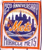 Miracle Mets 25th Anniversary commemorative patch.
|
A patch commemorating 125th Anniversary of Major League Baseball is worn,
for this season only, by all teams. It is similar to the patch worn by
all teams in 1969 commemorating Major League Baseball's 100th Anniversary.
The Mets wear the 125th Anniversary patch on the right sleeve of both home
and road uniforms. (personal photographs, July 1994).
Numbers are added to the front of the uniform for the first time
since the 1987 season. Placed at the lower left, the numbers
are 3-color (royal blue with orange outline and white outline),
4-inch; and are block.
Mets "skyline" logo patch on left sleeve of both home and road jerseys is replaced,
for this season only, with a patch commemorating the Mets' 1969 World Series victory.
The patch is rectangular: The words "25th Anniversary" are embroidered in bridge lettering
above the centered Mets "skyline" logo, and the words "Miracle Mets"
embroidered in reverse bridge lettering below the logo.
(New York Mets 1994 Official Yearbook, cover).
1995
Mets "skyline" logo is returned to the left sleeve
of both the home and road uniforms.
The lettering of the word "Mets" on the front of the home
jersey is changed back to the style script that had been used
on the home jersey from 1962 through 1992. It is still on an
upward slant and all lettering is still royal blue with a double
outline of orange (inner) and white (outer).
The lettering of the words "New York" on the front of the road jersey
is changed back to the fancy style that had been used on the road jersey
from 1962 through 1973. All lettering on the road uniform
continues to be royal blue with an orange outline. The white outline, which remains on the home uniform lettering, is gone from the road jersey.
The royal blue piping from that era that ran down the front of the jersey
and down the sides of the pants also returns. Royal blue piping also
replaces the three thin equal-width stripes (royal blue-orange-royal blue)
at sleeve edges. This blue piping around the sleeve edges was not present
on any of the previous (1962-1973) versions of the road uniform.
Although the road uniforms from 1962 through 1973, on whose design this uniform is based, had full-block numbers, the numbers on this jersey are block.
A slight change is made to the cap. The color of the button on
top of the cap is changed to orange.
It had previously been royal blue, the color of the cap.
1996
An logo is worn, for this season only, on the right sleeve of both the home
and road uniforms in honor of National League umpire John McSherry,
who died of a heart attack in Cincinnati on the field during a game
on the opening day of the season.
The logo is not a patch, but is embroidered in black directly onto
the right sleeve of both the home and road uniforms. The design depicts a
home plate with two baseball bats cris-crossing behind it. "J. M., N.L. Umpire, 10"
is printed on the logo in Times New Roman. The memorial logo was designed by
Russ Gompers, whose company does all of the lettering on the New York Mets' jerseys.
1997
An alternate home uniform is added. The lettering and numbering is the same as the
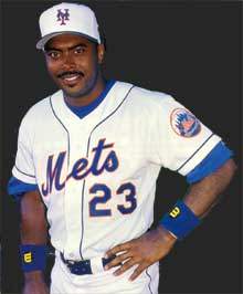 Bernard Gilkey in the 1997 ice cream cap and jersey.
|
regular home uniform, but the alternate uniform is all white (no pinstripes),
referred to by the team as "snow-white," with royal blue piping down the front
of the button-down jersey, around the sleeve edges and down the sides of the pants.
The Mets "skyline" logo is on the left sleeve.
An alternate cap is added. The alternate cap is white, with
a royal blue brim, and a royal blue button on top. The orange
interlocking "NY" that appears on the regular cap also appears
on the alternate cap, but with a new royal blue outline.
This cap, sometimes referred to as the "ice cream man" cap,
is only used in the 1997 season.
A patch commemorating 50th Anniversary of Jackie Robinson's Major League debut is worn,
for this season only, by all teams.
The Mets wear it on the right sleeve of both home and road uniforms.
1998
Black is added to royal blue and orange as a third official team color.
The alternate cap is changed. The new alternate cap is black,
with a royal blue brim, and a royal blue button on top.
The interlocking "NY" that appears on this cap is royal blue with an orange outline.
A slight change is made to the snow-white home alternate jersey.
The white (outer) outline on all lettering and numbering
is replaced with a black drop-shadow.
A slight change is made to the road gray jersey, the one
that has "New York" across the front in fancy letters.
A black drop-shadow is added to all lettering and numbering on this jersey.
A second alternate jersey is added, which is worn both
at home and on the road. It is a black button-down jersey with "Mets"
in script across front on an upward slant and 4-inch block numbers at the lower left.
All lettering and numbering is royal blue with a white outline and
an orange drop-shadow. There is royal blue piping down the front and around
the sleeve edges, and the Mets "skyline" logo appears on the left sleeve.
The Mets now have four uniform jerseys: Home pinstripe jersey, home "snow-white"
alternate jersey, road gray jersey and black alternate jersey, used both at home and on the road.
A black undersweater and black stirrups begin to be used, alternated
with the regular royal blue undersweater and royal blue stirrups.
1999
A second, all-black, alternate cap is added. The interlocking "NY" logo
appears on the front in royal blue, outlined in white with an orange drop-shadow.
Player names are removed from the back of the three jerseys worn at home:
The pinstripe jersey, the "snow-white" jersey and the home black alternate
jersey. This is the first time since 1977 that the Mets use a jersey that
does not have player names on the back.
A black drop-shadow is added to all lettering on the home pinstripe jersey.
This black drop-shadow replaces the white outline that had been on
the lettering of the home pinstripe jersey since 1991.
Black undersweaters and black stirrups begin to be worn with the home
pinstripe uniform for the first time.
An alternate black road jersey is added. It is a black button-down
jersey with "New York" in fancy lettering across the front and four-inch
block numbers at the lower left. All lettering and numbering is royal blue with
a white outline and an orange drop-shadow. There is royal blue piping down
the front and around the sleeve edges.
The Mets "skyline" logo appears on the left sleeve, with alternate coloring:
The alternate color of the skyline part of the logo is black (normally royal blue),
and the alternate color of the lettering of the word "Mets" within the logo
is royal blue with a white outline and an orange drop-shadow
(normally orange with a white outline).
This alternate coloring of the Mets "skyline" logo appears only
on the two black alternate jerseys; the logo has its regular coloring
on the road gray, home "snow-white" and home pinstripe jerseys.
According to a New York Mets press release, "The Mets have not abandoned
their traditional pinstripe uniform. Blue pinstripes are still the official
home uniform along with the blue cap. The snow-white uniform also remains a
popular home alternate. All home and road uniforms will be rotated along
with the team's three caps."
(Mets press release, Monday, November 2, 1998, "Mets Add a New Black
Road Jersey and Second Black Alternate Cap for the 1999 Season").
A slight change is made to the Mets "skyline" logo sleeve patch.
The small, interlocking "NY" that had always been to the right of the word
"Mets" is removed.
The "NY" had previously appeared on both the original "skyline" patch,
which had been unchanged since 1962, and the alternately-colored "skyline"
sleeve patch that was introduced in 1999.
From www.villagevoice.com:
"Amid all the hoopla recently
generated by the possibility of a Subway Series, nobody's noticed that the
Mets appear to have conceded a small aspect of the battle for New York.
The team's interlocking 'NY' insignia, which appears on the club's caps
and had also appeared on the left side of the Amazins' skyline logo design
since the franchise's 1962 inception, was quietly removed from the logo at
the beginning of this season.
"Are the Mets, who've always drawn a hefty percentage of their fans from
Long Island, trying to downplay their urban identity? Not according to
Mark Bingham, the team's senior vice president of marketing, who says, 'Of
course we're proud to be from New York.' So why alter the logo? 'The 'NY'
on the logo never matched the one on the caps,' Bingham explains. 'The one
on the logo was more primitive-looking, sort of a stick-figure "NY." At
the end of last year we wanted to dress it up and have it match the "NY"
on the caps, but then we said to ourselves, "Why do we need it on the logo
anyway?"'
"Interestingly, many media outlets either unmindful of or indifferent to
the subtle change have continued to use the old 'NY'-inclusive logo
design. Does this bug Bingham and his staff? 'Nah. The truth is, the old
logo is probably still featured on a lot of the signs here at the
stadium,' he says. 'We try not to go crazy about it.'"
("Jockbeat: Uni Watch: Mets Concede," Paul Lukas,
Village Voice, October 13 - 19, 1999)
All teams begin to use "batting practice caps" in spring training and before games.
("Batting practice caps" will not be extensively documented, as they
are not part of the "game" uniform. Nevertheless, it is significant
to note when teams began using them regularly).
2000
All teams add the official Major League Baseball logo to the back of their home,
road and batting practice jerseys. It is small and in the center, above the number and name.
Rawlings becomes the Mets' official uniform manufacturer, and the Rawlings logo is
embroidered onto the left sleeve of all jerseys. Up until now, manufacturer logos
had appeared on the right sleeve. From 1992 through 1999, Russell Athletic had been
the official uniform manufacturer for all Major League teams.
Rawlings had previously been the official uniform manufacturer for all
Major League teams from 1987 through 1991. Incidentally, the appearance
of the Rawlings logo on uniforms in 1987 marked the first time a manufacturer's
logo appeared on the outside of a Major League Baseball team uniform.
Unlike the 1987 Rawlings logo, which consisted of the entire word "Rawlings,"
this new Rawlings logo was simply the Rawlings "R" in a circle.
The Mets open the 2000 season at the Tokyo Dome in Japan with a two-game series against
the Chicago Cubs. For these games, a patch is worn on the right sleeve of both Mets
and Cubs jerseys commemorating the first Major League baseball games to be played in Tokyo, Japan.
There is also a logo commemorating the Japan trip embroidered onto the left side of both teams' caps.
The Mets are the "home" team for game one this series and the "away" team for game two.
They wear the following uniform combinations:
Game One: The Mets wear their home "snow-white" alternate uniforms,
with black undersweaters, and the black and blue alternate cap.
This is the alternate cap with a royal blue brim, and a royal blue button on top.
The interlocking "NY" that appears on the black and blue
alternate cap is royal blue with an orange outline.
Game Two: The Mets wear their road gray uniforms, with black undersweaters, and the black and blue alternate cap.
Player names are returned to the back of the three jerseys worn at home:
The pinstripe jersey, the "snow-white" jersey and the home black alternate jersey.
Player names had been removed for the 1999 season in an effort to give the
home uniform a more traditional, old-fashioned look.
During the World Series, the Mets have the official 2000 World Series logo embroidered
onto the left side of all their caps. It had been common practice since the
1996 World Series for both of the year's participating teams to feature the current
year's World Series logo in this fashion.
2001
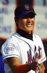 The patch honoring Tommie Agee and Brian Cole can be seen here
on Tsuyoshi Shinjo's right sleeve.
|
A patch is worn, for one game only, on the right sleeve in
honor of both former Met player
Tommie Agee
and prospect Brian Cole. Agee
died of a heart attack January 22, 2001 and Cole was killed in an
automobile accident March 31, 2001. The round patch is white with a
black border, has stitches across the top and bottom of it (to make the
circular patch look like a baseball), and has "20/60" embroidered across the
center in a font most closely resembling Arial.
The Mets had opened the season on the road and did not wear the patch for
the first six road games. Its first and only appearance on the uniform is
at the Mets home opener on April 10, 2001,
where Agee was honored as part of the pre-game ceremonies.
It is surprising that the Mets chose to honor a player of Agee's stature
with a patch that is only worn for one game, considering his importance to
the team's history. The Braves, who were the Mets opponent that opening
day, were honoring the recently deceased Eddie Matthews with a similar
patch on their uniform. By contrast, the Braves wore their patch for the
entire season, both at home and on the road.
"Maxcine Agee, Tommie's
widow, was
escorted to the mound by her husband's teammate, and former Mets great,
Tom Seaver.
She threw out the first pitch to a standing ovation. Her husband and Cole
were also honored with a patch worn on the right sleeve of the Mets'
uniforms. The patch featured the 20 and 60, the numbers worn by Agee and
Cole." ("Home Opener Thick With Emotions," Kevin T. Czerwinski,
www.mets.com, April 9, 2001)
Although "batting practice caps" will not be documented in any
great detail here, it is significant to note one development that
occurred this season to the spring training "batting practice cap."
The "batting practice caps" of several teams, the Mets among them, featured
an embroidered palm tree logo on the back center of the cap, just above
the Major League Baseball logo.
In response to the September 11, 2001 terrorist attack on the
World Trade Center in New York and the Pentagon in Washington, D.C.,
a slight change is made to the uniforms, caps and helmets of the Mets
and, in fact all, Major League teams on Monday, Septermber 17, 2001.
The following description of the change is made up of excerpts
from an article posted to
www.mlb.com,
the official web site of Major League Baseball:
"To show suppport of America during this time of crisis, every MLB player,
manager and coach will wear an American flag patch on his cap and jersey for
the rest of the season. A patch of the American flag will be sewn on the back
of the jerseys, just above the letters [covering the MLB logo that was
added to all uniforms at the beginning of the 2000 season (see 2000 entry)].
It will replace the MLB logo because MLB wanted a meaningful symbolic gesture.
'The symbolism is important,' said MLB Senior Vice President Howard Smith.
'This thing is much bigger than the game... and the best way to portray
that is cover up the MLB logo with the flag.'
"A 1 x 1/2 inch flag will also be stitched on the left side of every cap,
which takes about an hour to do 20-25 hats. The work is being completed
by the New Era Cap Co. They figure 'there are about 1000 hats to do,
so they have a lot of work to do,' according to Smith. The MLB logo on
the side of all the bases also will be covered by a flag, and batting
helmets will also be adorned with the symbol."
("MLB Players To Wear Flags For Rest Of Season," Jim Molony, MLB.com, September 15, 2001)
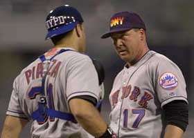 Mike Piazza wears an NYPD helmet, and Kevin Appier an FDNY cap on September 18, 2001
at PNC Park in Pittsburgh. The American flag can also be seen on Piazza's back.
|
[The flag appears on the
helmet on whichever side of the helmet has the ear-flap. Also, the
American flag on Piazza's catcher's helmet is placed on the right,
so that when the catcher wears his helmet backwards the flag will appear
on the same side as it does on the caps.]
Additionally, the Mets make a temporary change in their game uniform for their
September 18th and 19th games in Pittsburgh against the Pirates, and for their
September 21 game at Shea Stadium against Atlanta. To honor New York City's Fire,
Police and EMS (Emergency Medial Service) Departments, the Mets replace their
game caps with caps featuring various logos from those three agencies.
Catcher Mike Piazza, who wears a helmet under his catcher's mask, wears a
black helmet with a blue brim with "NYPD" replacing the Mets "NY" logo.
This is notable because it is the only helmet that features any logo other than the Mets "NY".
They had also worn these caps on September 17 during batting practice and pre-game ceremonies, switching to their game caps for the actual game (except for Mets manager Bobby Valentine, who continued to wear his NYPD cap throughout the game on the 17th as well).
2002
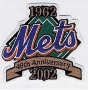 40th Anniversary sleeve patch
|
A patch commemorating the New York Mets' 40th Anniversary is worn, for
this season only, on the right sleeve. Beneath the patch, also on the
right sleeve, remains the embroidered "9-11-01" that was added during the
2001 season in remembrance of the September 11, 2001 terrorist attack.
The American flag patch covering the MLB logo that is on the back
of all jerseys that was added in 2001 after the terrorist attacks is gone;
the MLB logo above the player name is uncovered in 2002.
On Memorial Day, May 27, 2002, the Mets (and all MLB teams) wear caps with
a 1 x 1/2 inch flag stitched onto the left side. The Mets are at home on
this date, playing the Florida Marlins, and they wear their "snow white"
alternate uniform with black undershirt and blue and black cap.
On Independence Day, July 4, 2002, the Mets (and all MLB teams) wear caps
with a 1 x 1/2 inch flag stitched onto the left side. The Mets are on the
road on this date, playing the Florida Marlins. They wear their gray
uniform with black undershirt and blue and black cap.
2003
The right sleeve of all jerseys is once again empty. The 40th Anniversary patch from 2002 is gone, as is the embroidered "9-11-01," which had remained on the right sleeve through the 2002 season. Other than the above changes to the right sleeve, there are no changes in the game uniform from 2002 to 2003.
All teams begin to use batting practice jerseys and caps (in spring training and before games) the design of which has been standardized (and heavily marketed) by Major League Baseball. The Mets finally use the last of their colors that has not previously been the main color of a jersey: orange.
On Memorial Day and Independence Day, the Mets (and all MLB teams) wear caps with a 1 x 1/2 inch flag stitched onto the left side.
Although the pinstripe uniform is still technically the "official" home uniform, it continues to be used very sparingly. Most of the time, the Mets wear one of their home "alternate" variations.
2004
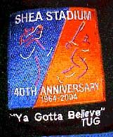
A patch commemorating Shea Stadium's 40th Anniversary is worn, for this season only,
on the right sleeve. The patch is designed to be reminiscent of the World's Fair patch
worn by the Mets in 1964.
The patch also incorporates two of the neon sculpture figures that were added to the outside of
the stadium in the 1980's. Beneath the patch, also on the right sleeve, there is an
embroidered inscription in a font closely resembling Arial which reads,

|
"Ya Gotta Believe" followed by "TUG" in honor of former Met player Tug McGraw.
McGraw died on January 5, 2004 of brain cancer at age 59. Incidentally, McGraw
is also memorialized this season on the uniforms of the Phillies, for whom he
played during the latter half of his career.
"It's unusual for an athlete to have such an impact on two franchises that they both
memorialize him upon his passing. But Tug McGraw, the key character on both the
Mets' pennant-winning team in 1973 and the Phillies' 1980 world championship team,
was a special guy. With McGraw having passed away last winter, the Mets have honored
him by embroidering his signature rallying cry, 'Ya Gotta Believe,' onto their right
sleeves (it's hard to see, but look beneath that huge, garish patch they're wearing
to celebrate Shea Stadium's 40th anniversary), while the Phillies have drawn on
McGraw's Irish heritage by wearing a shamrock sleeve patch inscribed with 'Tug.'"
(Paul Lukas' column, Uni Watch, on slate.msn.com, May 17, 2004:
"You're Dead. Here's your uniform tribute.")
From April 14, 2004 to April 22, 2004, the Mets wear an "Opening Day" cap logo on the
left side of their caps. It is unusual that the logo does not appear on the Mets'
caps until the 14th because their home opener took place two days earlier, April 12, 2004.
Nevertheless, the logo does not appear on the caps until April 14, 2004, which was
the first annual Jackie Robinson Day. Since the logo is so small and made its
first appearance on Jackie Robinson Day, there was a misconception that the
logo was a Jackie Robinson Day logo and not an Opening Day logo. However,
the logo that appeared on the caps from April 14-22, 2004 is the same Opening Day
logo that was painted on the field on April 12 (the actual home opener). The
logo was also used by other teams on opening day.
The Mets did not wear their blue caps between April 14th and April 22nd, so the 2004 Opening Day cap logo never appeared on a blue cap in game use.
|
2004 Opening Day Cap Logo Dates
|
| DATE |
CAP WORN |
UNIFORM WORN |
| Wednesday, April 14, 2004 | Black & Blue | Snow White |
| Thursday, April 15, 2004 | Black & Blue | Pinstripes |
| Friday, April 16, 2004 | Black | Black Top, White Pants |
| Saturday, April 17, 2004 | Black & Blue | Pinstripes |
| Sunday, April 18, 2004 | Black & Blue | Snow White |
| Monday, April 19, 2004 | Black | Black Top, White Pants |
| Tuesday, April 20, 2004 | Black | Black Top, White Pants |
| Wednesday, April 21, 2004 | Black | Black Top, White Pants |
| Thursday, April 22, 2004 | Black & Blue | Snow White |
On Sunday, June 27, 2004, two Mets players, Tom Wilson and Jose Parra, appear in a road
game against the Yankees wearing a different jersey than the rest of the team.
While the Mets wear their black alternate road jerseys, which read "New York"
in fancy lettering across the front, Wilson and Parra are wearing the black alternate
home jersey, which is identical except for the lettering on the front of the jersey.
The front of the black alternate home jersey has the word "Mets" on it in the same script
lettering that appears in the official team logo.
The mistake occurred during the second game of a day-night doubleheader and was
reported on by the Associated Press. From www.espn.com, June 27, 2004:
"NEW YORK -- If the clothes make the man, the New York Mets were in trouble Sunday night.
Catcher Tom Wilson and reliever Jose Parra were forced to wear different jerseys than
their teammates for the second game of a day-night doubleheader against the Yankees
because the Mets didn't bring along the correct ones.
"The Mets wore gray uniforms for the opener, an 8-1 loss. For the night game, they
wore black jerseys with 'New York' across the chest. Wilson and Parra wore jerseys
in the night game that had 'Mets' on it in script, a shirt used for home games.
Even after the game, Wilson was unaware he had been dressed differently.
"'I had no idea,' he said."
(Uniform blunder: 2 Mets wear wrong jerseys. Wilson, Parra out of step for nightcap.
- Associated Press)
Tom Glavine and Mike Piazza are the lone Mets representatives at the 2004 All-Star game,
and appear in the "snow white" alternate home jersey. On each player's game uniform,
the Shea Stadium 40th Anniversary patch on the right sleeve is replaced by the
2004 All-Star Game logo. The Tug McGraw memorial, however, remains on the sleeve,
just below the All-Star logo.
Adam Rubin of the New York Daily News reports on the uniform change in the Mets Notebook
column of the Sunday, July 11, 2004 issue. In his report, he refers to this uniform as
the "white home uniform." The Mets still consider the snow-white jersey to which
Rubin refers as one of the "alternate" home uniforms. The pinstripe uniform, despite
its infrequent use, is still the "official" home uniform.
Even when the Mets pinstripe home uniform makes a rare appearance, it is often paired
with one of the black alternate caps instead of the more traditional all-blue cap.
It has been speculated that the reason for the scarcity of appearances of the
all-blue cap is that the dugout jacket is black and as such does not go well with
the all-blue cap. In order to minimize instances of players wearing the all-blue
hat with the black jacket, it is rumored that the Mets try not to wear the
all-blue hat in any weather except the hottest of temperatures, since almost
no one will be wearing the jacket on an extremely hot day.
(A statement to this effect was repeated to me and attributed to Mets Equipment
Manager Charlie Samuels in early 2004, but to date is unverified by this author.)


 John Stearns wearing new 1978 pullover jersey

 Miracle Mets 25th Anniversary commemorative patch.
 Bernard Gilkey in the 1997 ice cream cap and jersey.
 The patch honoring Tommie Agee and Brian Cole can be seen here
on Tsuyoshi Shinjo's right sleeve.
 Mike Piazza wears an NYPD helmet, and Kevin Appier an FDNY cap on September 18, 2001
at PNC Park in Pittsburgh. The American flag can also be seen on Piazza's back.
 40th Anniversary sleeve patch
